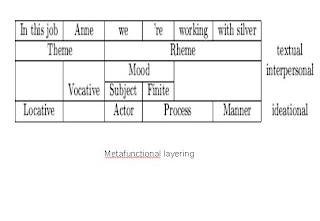
Secondly, even though an explanatory diagram to illustrate metafunctional layering has been added (Fig 2), the meanings in the diagram were lost in translation. Schema theory (Putnis & Petelin, 1996, p. 238) suggests that readers need prior knowledge and experience of the subject (in this case linguistics) to decode specific meanings such as ‘rheme’. The level of schemata required here is too extensive for the casual reader.
Kress and van Leeuwen (2006) elaborate on the current importance of visual literacy, whereby a picture can stand on its own, in delivering a message. However, Fig 3 proves an exception to this rule. The symbolic meaning of the rabbit in the bottle is too open to interpretation, aside from vague connotations to reproduction and contraception. As Schriver (1997) suggests, in certain contexts some integrated prose would help in clarifying the documents intended message.

Reep (1997) states that proportion, such as size and placement of texts, is an important design principle. In Fig 4, the slide looks crammed and disproportionate as the space between the heading and body text is too small, the typeface is identical , and there is a lack of contrast between the background and text colour. The typography, which influences the reader's approach to the document (Shriver, 1997) is too conservative and could be changed.
Reep (2006) states that headings direct the readers’ attention to the subject, and separate the main points so that readers’ understand the flow of the document. In the first three slides there are no headings, therefore the subject is not clearly framed to the reader. The fourth slide’s heading accurately frames it and leads to a logical flow in the slide points.
Minor grammatical errors, such as confusion between past and present tense (point 3) indicate mechanical problems, and do not conform to accepted business conventions (Putnis & Petelin, 1996). The writing could be of a higher standard in order to enhance the professional credibility of the document and the document creators.
References:
Kress, G & van Leeuwen, TV, 2006, Reading images: The grammar of visual design, 2nd edn, Routledge, London
Putnis, P, Petelin, R 1996 ‘Writing to communicate’ in Professional Communication: Principles and Applications, Prentice Hall, Sydney
Reep, D.C. 2006, ‘Chp 4: Principles of Document Design,’ in Technical Writing, 6th ed., Pearson Edu, Inc., New York, p.173-190.
Rothman, S 2005 What Makes Good Scientific and Technical Writing, associatedcontent.com, viewed 2 September 2009
Schriver,K.A. 1997, Chapter 6: Dynamics in document design: creating texts for readers, Wiley Computer Pub., New York